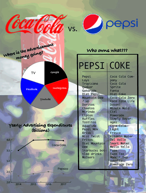
For this project, I wanted to do something that was simple yet got the point across. The article that I designed this infographic for is about the competition between Pepsi and Coca-Cola and how Pepsi wants to step it up to match Coca-Cola’s marketing budget. My background for the infographic is a combination of two vector images that display both Pepsi and Coca-Cola. I lowered the opacity in order for the charts and graphs to still show through. I made just a typical line graph to show the difference in spending between the two companies to really show how much more Coca-Cola spends. Also, I did the pie graph to show the different platforms that the advertisement money is being spent on. Finally, the third chart I wanted to look like the nutrition facts on a label but really it’s comparing the different brands that each of the company owns to really demonstrate that when each company spends billions of dollars on advertising, they are really spending on all of these brands. In order to make this chart, I used the line tool and played around with the thickness. I also changed the font to fit with the theme I was going for. For the title of the infographic, I just went with their basic logos on the top to show that these companies are competing against one another.